





Two updates from Pic-Time, and which to do first


Sponsor news
Somewhere right now a photographer is opening an email that says “we love them!!!” and then lists forty-one numbers, three of which do not exist. 4. 9. 14. The one where dad is laughing. The dog one. She is not sure of the number on the dog one. There is no dog in the gallery.
The sister’s list lands an hour later. It disagrees with the first list. She thinks 9 is the wrong 9.
Pic-Time has spent this year rebuilding the whole platform. Two new pieces landed this month. One of them kills that email. The other one lets you take one of their templates and make it unmistakably yours.
Here is what each one does, and which one to turn on first.
Client Hub
Picking photos currently works like this. You send a gallery. They send numbers. Her dad sends different numbers on a Sunday night. Somebody replies to the wrong email. Somebody else screenshots a photo, crops it, and sends it back with an arrow drawn on it. An uncle votes by WhatsApp, twice. Two weeks go by. You have four lists and no album.
Client Hub drags all of that into the gallery.
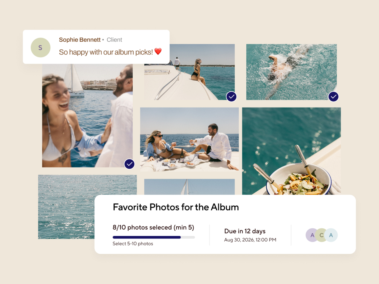
You make a Selection Request. You say what it is for: album, retouching, final approvals, whatever the job is. You say how many photos they get. Ten. Or anywhere between five and twenty. Your call. You give them a deadline.
Then you say who is allowed in. The couple. A second shooter. A retoucher. An agency. The mother of the bride. The best man. Whoever you can face.
They open their gallery and there is an Inbox sitting there waiting. Nothing to download. No password to talk anyone through.
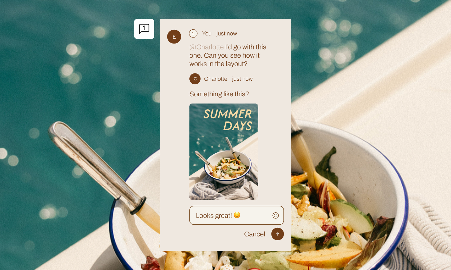
Everything happens on the photos. They tick the ones they want. They leave a comment next to the frame. They can stick a note on one spot in the picture, so nobody has to write “the one where his hand looks weird, third row, second from the left.” They argue with each other instead of with you.
You watch it fill up. When they are done you download the picks, or export a CSV, and get on with the edit.
Before you get excited
Check what you are paying for
Client Hub only runs on Pic-Time 2.0 galleries, and only on the Professional and Advanced plans. Live chat inside a request is Advanced alone. Worth a look at your account before you plan a job around it.
Client Hub, start to finish. Two minutes.
Custom Colors & Fonts
You paid somebody for a logo. You picked fonts. You chose colours, and you put them on everything. The site. The emails. The box the USB goes in.
Then you send a gallery link, and your client lands on something beautiful that looks exactly like the gallery they got from the photographer they did not book.
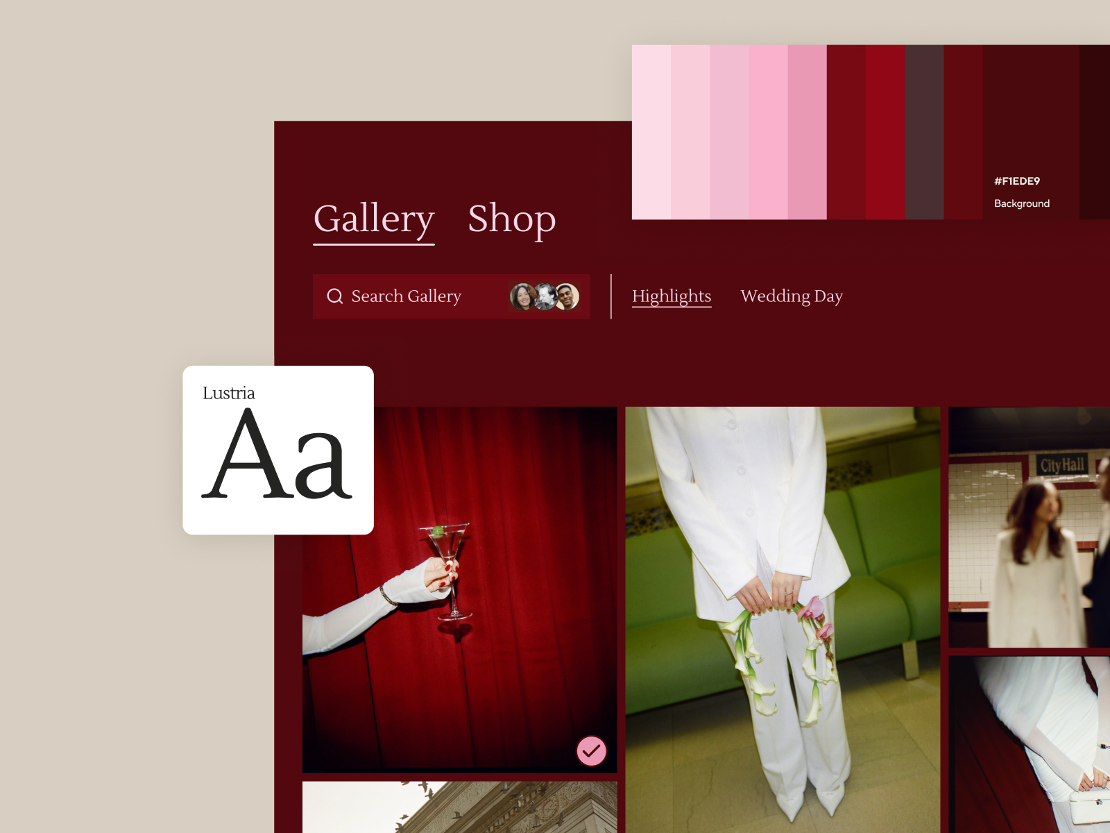
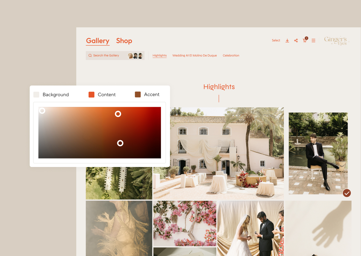
Here is the fix. Pick three colours. Background, Content, Accent. Pic-Time builds the rest of the palette out of those three by itself: hover states, buttons, selected photos, all the small bits you would never think to choose. Light version and dark version. Gallery and shop.
How it works
Three colours in, a whole system out
The three you pick.
BackgroundContentAccent
What it builds from them.
Ten shown here. The real thing makes a lot more, plus a dark set.
Fonts, same deal. Upload yours. Say which one is the headline and which one is the body. Pic-Time works out every size and weight so you do not have to.
Save the lot. Next gallery is one click.
Cannot face choosing? Every gallery now offers palettes pulled straight out of your own photographs.
The bit they barely mention
Smart Contrast Guidance
When you pick a colour, the picker shows two small white dots. Those mark the range where your colour is still readable. Wander outside it, hit Auto fix, and it drags you back in.
Take our own colours. Bronze and teal, both of them chosen for a logo. Here is the same button in each, white type on the bronze and dark type on the teal.
Buy a ticket
Buy a ticket
White on bronze · 2.8:1 · fails
Ink on teal · 6.4:1 · passes
Anything under 4.5 to 1 fails. The bronze one is not a matter of taste. A decent number of people cannot read it, on a phone, outdoors, at the end of the day.
We have used the bronze one. It looked fine to us on a good screen in a dark room, which is exactly the problem. Nobody writes in to tell you. People never do. They just leave.
So the rule here now is dark type on the accent colour, every time.
Your colours were chosen to look good on a business card. Putting them behind words people have to read is a different job. That is the whole reason those dots are there. Use them.
Colours and fonts, start to finish.
Which one first
Colours and fonts, tonight. Three colours, two typefaces, done, and every gallery you own changes.
Client Hub is the bigger one, so do not learn it at eleven at night with a client waiting. Set it up on a quiet day. Use it on the next job where more than two people have an opinion about the photographs.
And for the record: 9 was fine.
Pic-Time sponsors Way Up North. Their own write-ups are here: Client Hub and Custom Colors & Fonts.